Bates College BA Thesis, 2017

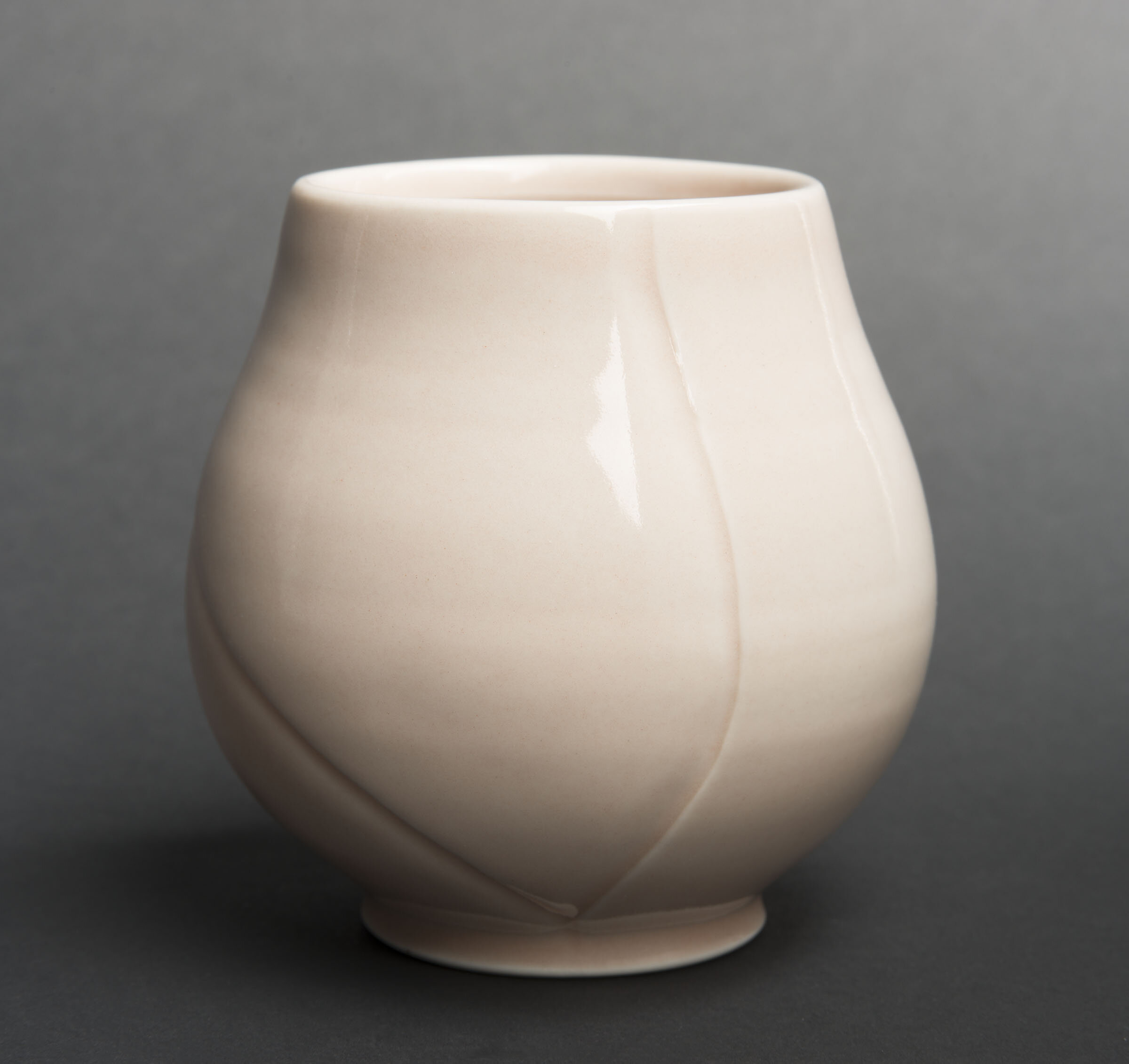
I need curves in my work. I feel a psychological satisfaction when I see smooth, continuous curves. The softness and warmth of a curve has an innate connection to the human body. For me, this connection is similar to the sense of fulfillment that I get when I communicate with someone on a deeply personal level, relating through shared experiences. This is what I strive for as an empathetic person.
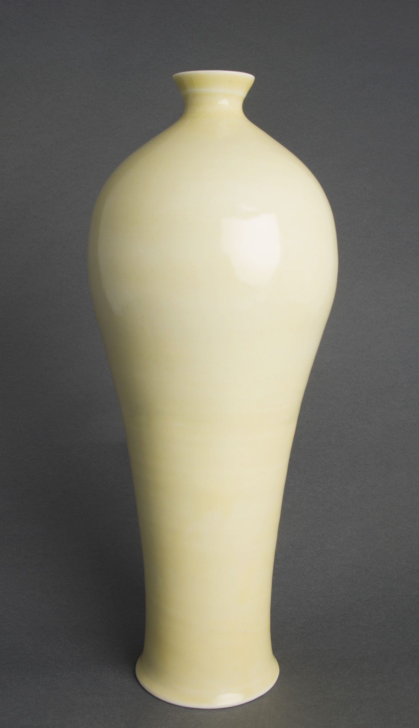
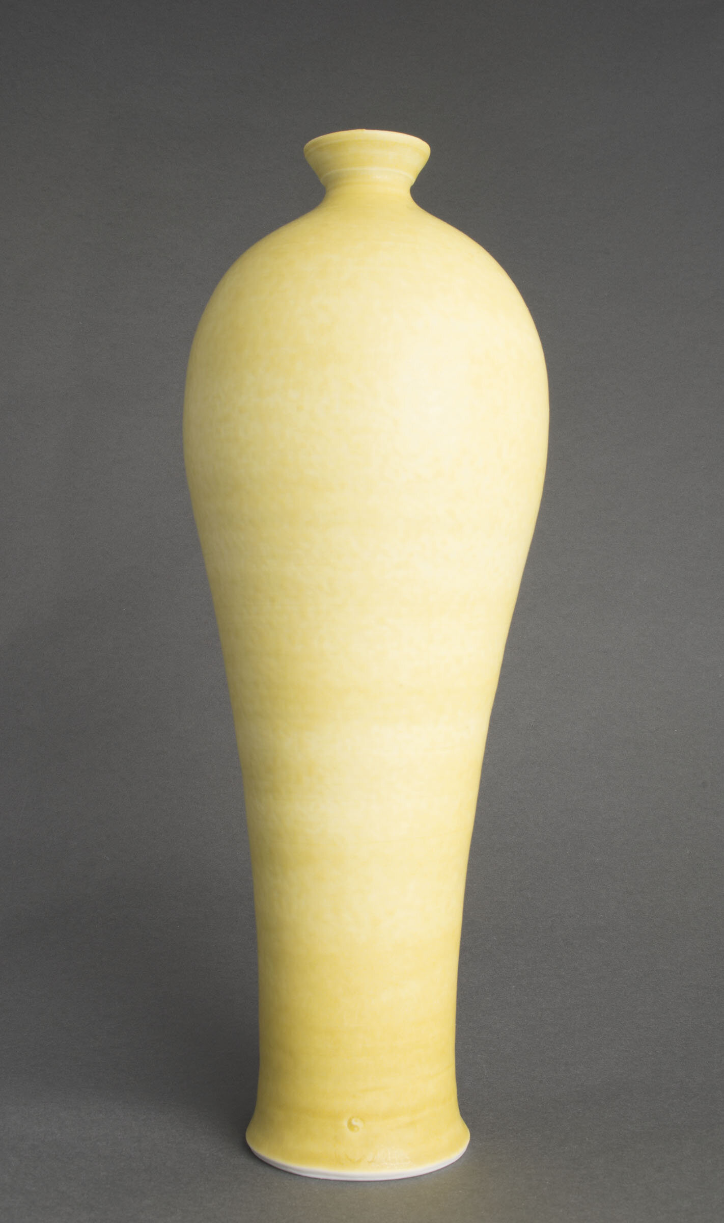
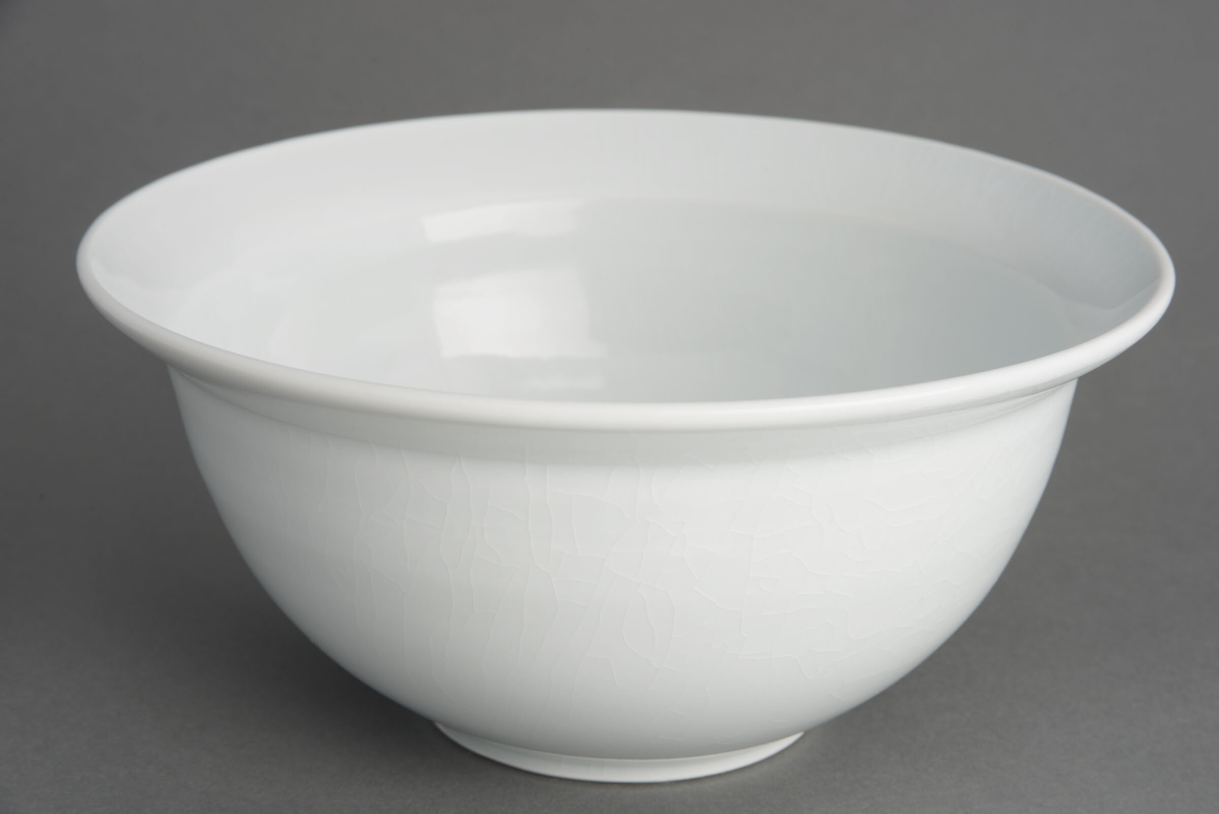
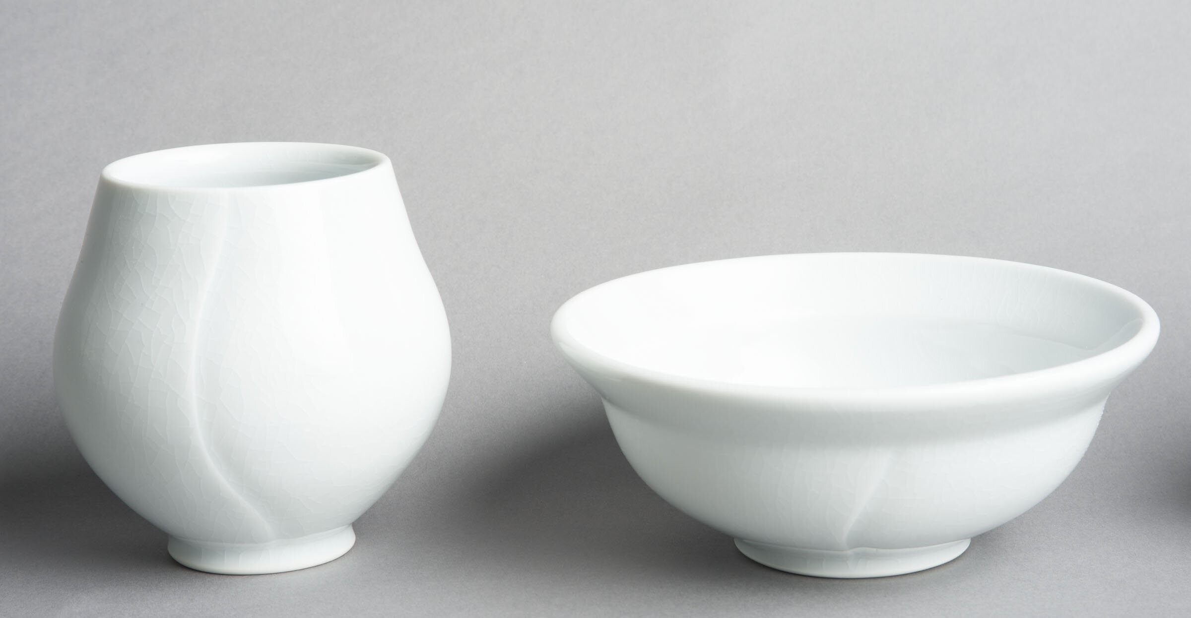
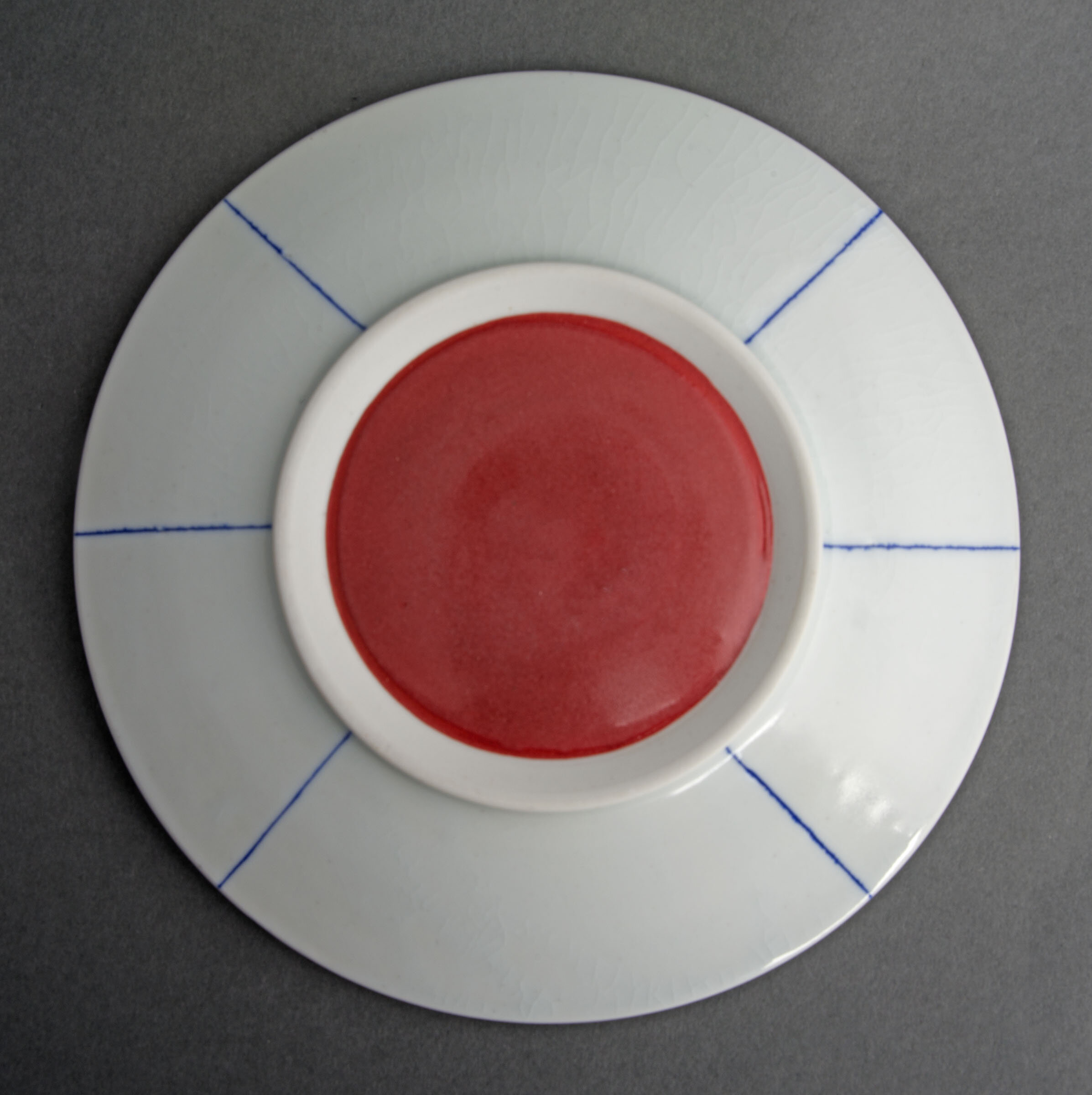
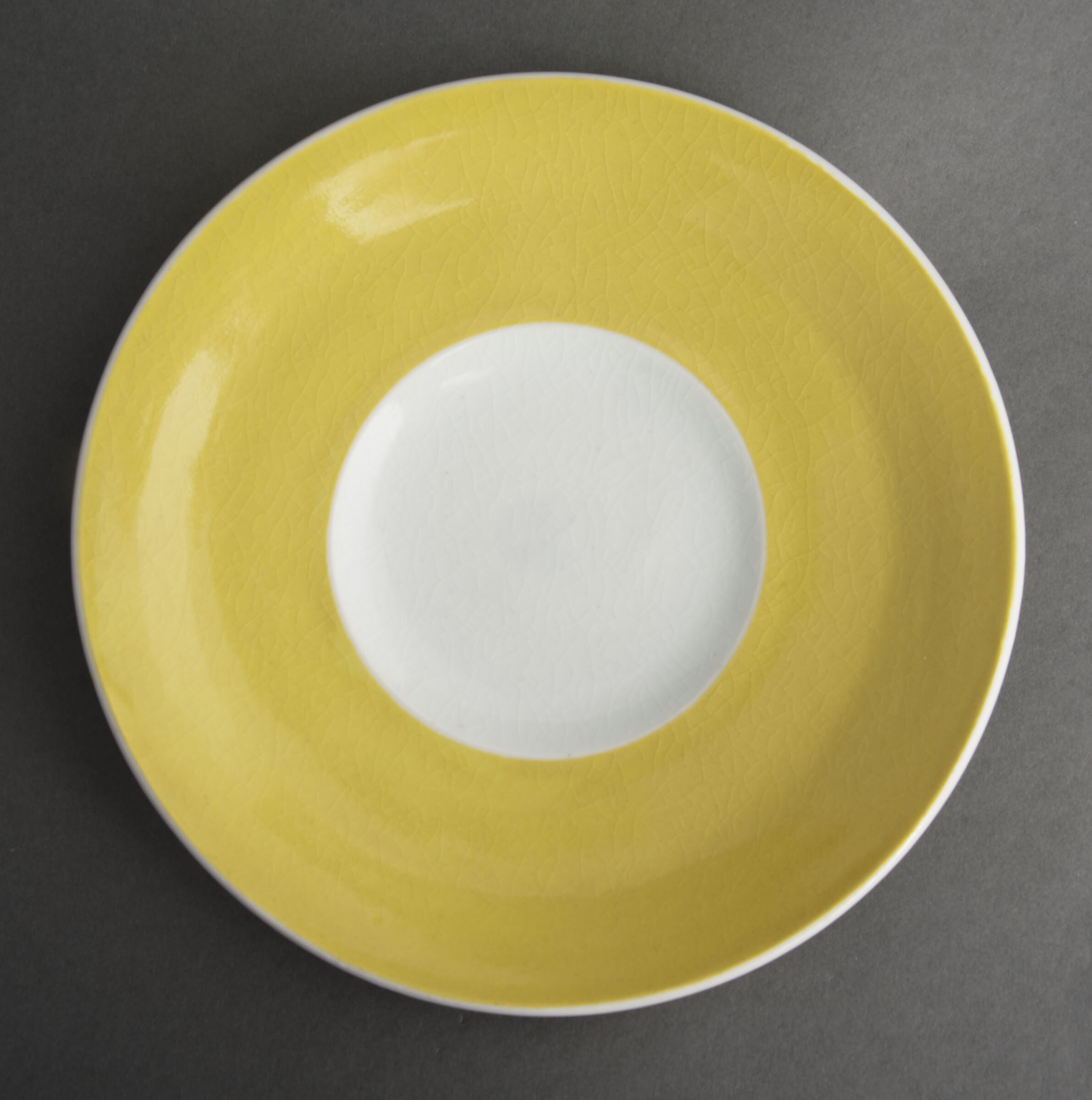
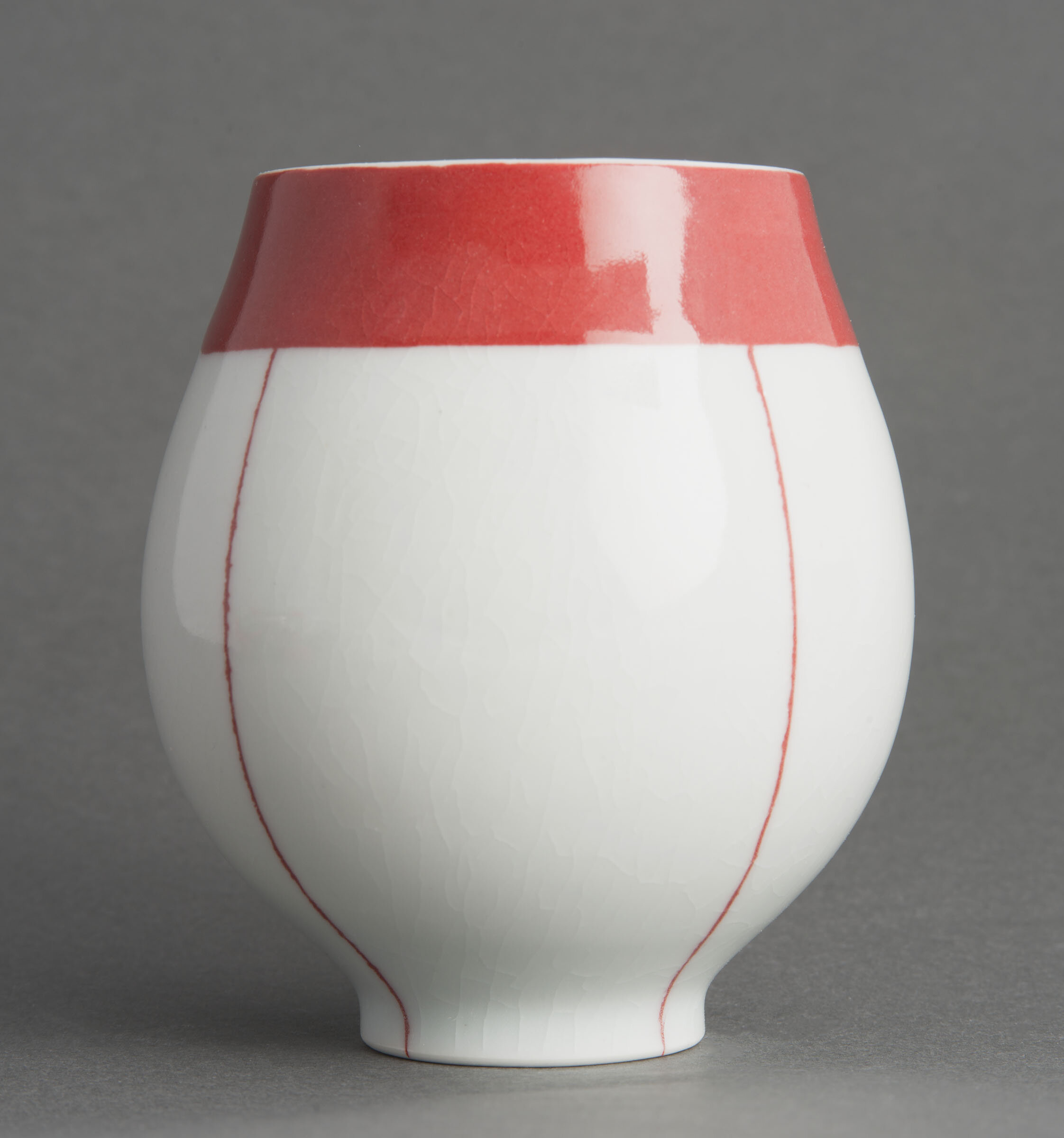
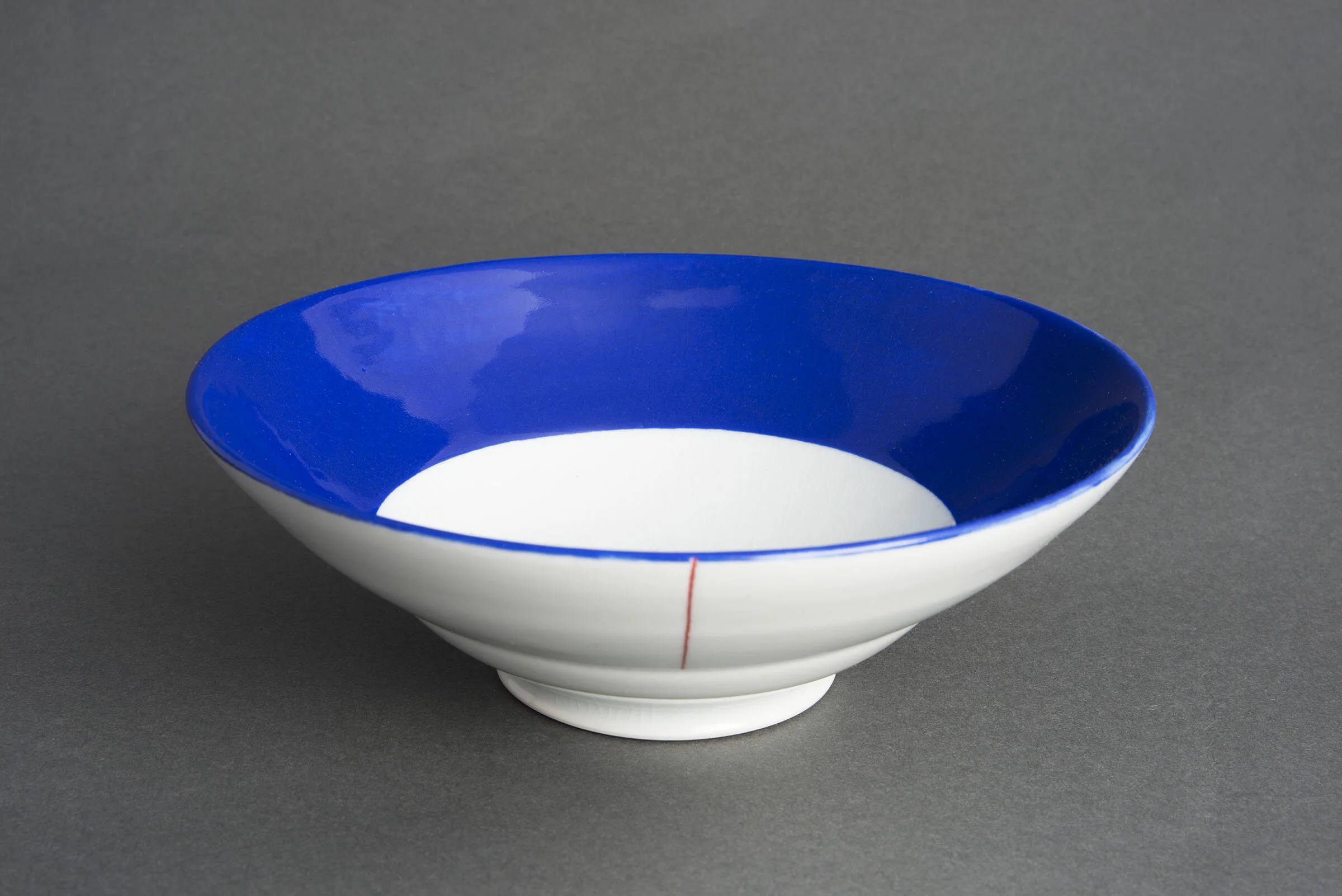
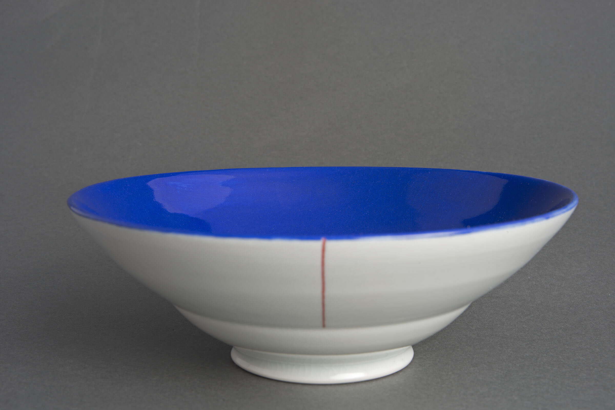
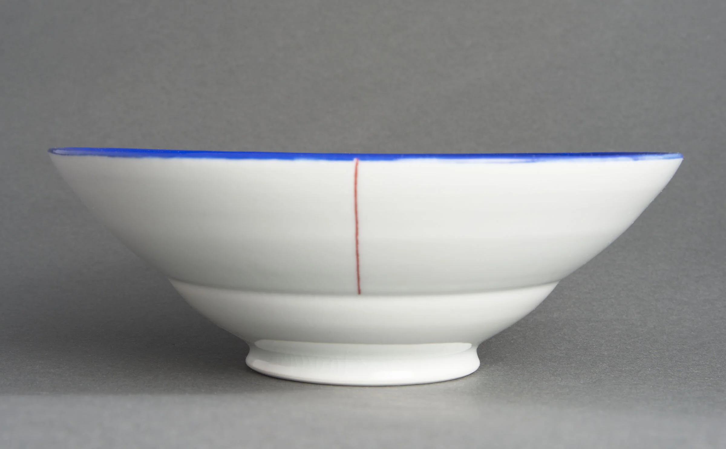
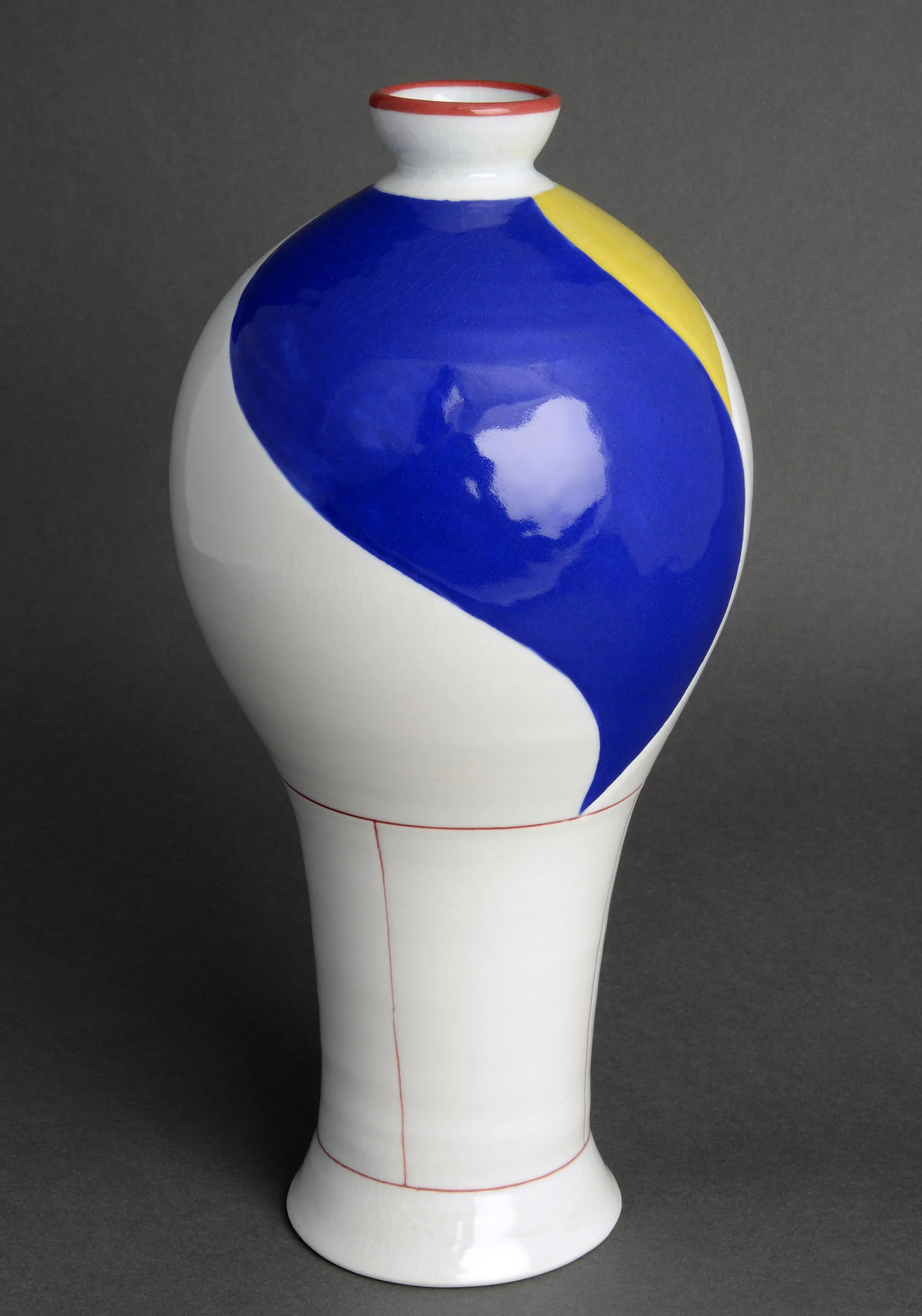
My main body of work is muted porcelain bottles and cups whose colors are pale and subtle. The contours of my pots, both bottles and other utilitarian tableware alike, are round and continuous. The surface decoration, often only a few carved lines around the form, helps to unify the form with its surface by inspiring in the viewer a desire to see the pots in 360 degrees, rotating them to see how the form and surface change as they physically move around the pot. This 360-degree view emphasizes the roundness of the pot and the placement of the lines accent the form of the pot. I constantly draw influence from Chinese Song, Yuan, and Qing dynasty porcelain ware, particularly the bottle forms of those periods. Their elegance and sophistication is timeless. Therefore, they are still considered one of the best examples of visually and structurally strong pots. Using porcelain clay, pale celadons, clear glazes, traditional Chinese “shallow-relief” carving techniques, and intensely focusing on refinement in my work are a way to honor my ancient Chinese sources. My use of bright color, however, is an attempt at marrying this source material to a more contemporary commercial ceramic industry.
Elegant, continuous curves are hard to create, therefore revision and editing are the most important parts of my process, and how I continually find a way to remain engaged with what I am making. In the past, I have gotten satisfaction from making and problem-solving to create meticulous forms that reference the Chinese bottles that I look to. Because of my desire for refinement and borderline perfectionism, I was surprised to find how natural form altering and making wobbly, ‘luse’ imperfect pots came for me. I am also interested in gestural sip trailing designs and juxtaposing blocks of intense colors to create mosaic surfaces on my pots. Exploring the interaction between luse and refined, ‘tight’ bottles presents new possibilities for powerful nuances in my work.


Calm 1


Calm 2
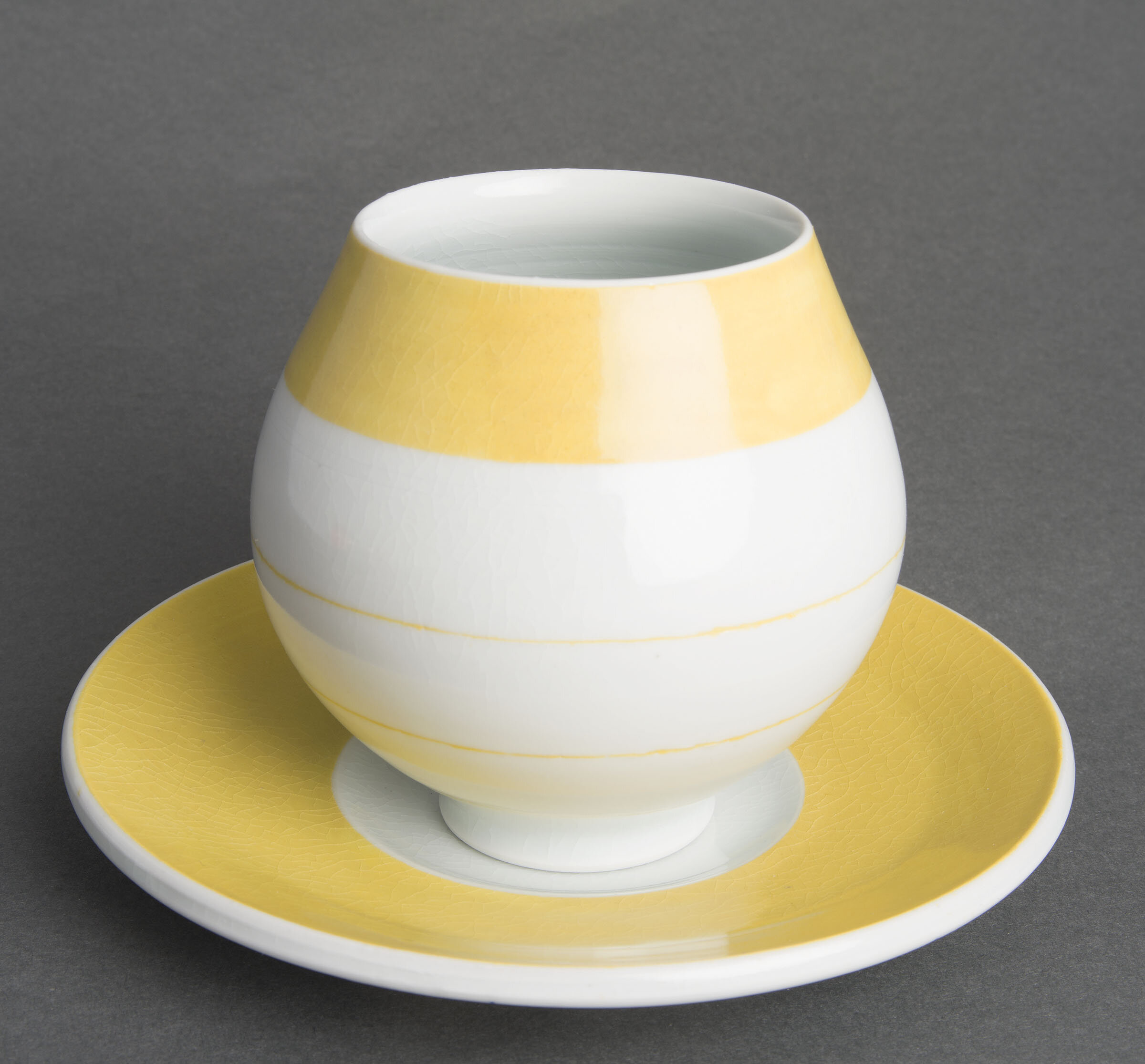


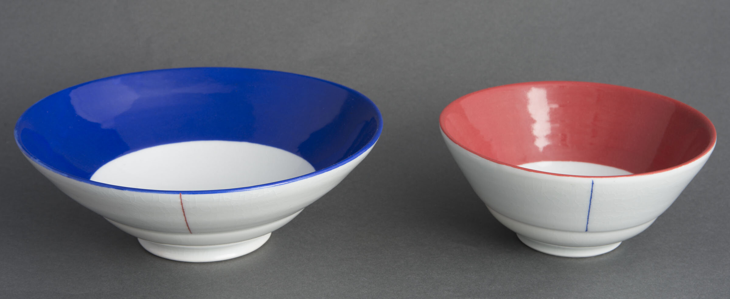
Primary Colors - Sugar High 1


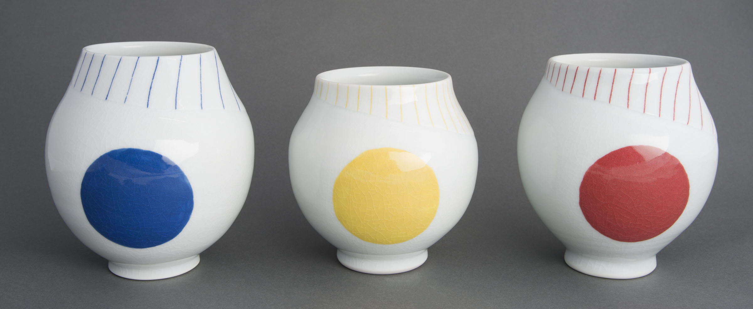


Primary Colors - Sugar High 2


Reflection